


In this article, you'll learn about the F-shaped, its underlying principles, its effectiveness, and how to develop it on your own website.
What is the F-shaped?
Users typically scan a webpage within seconds, and extensive research on eye-tracking and website user perception has led to the development of the F-shaped. This layout prioritizes the top, upper left corner, and left side of the page, while the right side is only occasionally glanced at. This is the typical way users consume internet content.
How does the F-shaped Work?
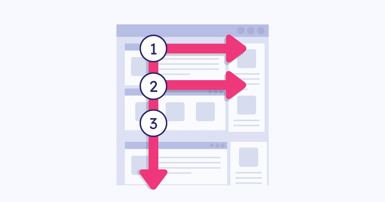
The F-shaped scanning pattern is identified by numerous fixations that are predominantly focused on the top and left-hand side of the page. To be more precise:
Typically, users start reading by moving their eyes horizontally across the upper portion of the content area. This initial element comprises the top bar of the letter "F".
Afterward, individuals scroll down the page slightly and then proceed to read horizontally, covering a smaller section than before. This creates the lower section of the letter F.
Users typically scan the left side of the content in a vertical motion. This can either be a slow and methodical scan, resulting in a solid line on an eye-tracking heatmap, or a quicker scan, resulting in a more scattered heatmap. The stem of the F is formed by this latter element.
Significant implications of this pattern
The First lines of text on a page tend to attract more attention compared to the following lines of text on the same page.
When reading, our eyes tend to focus more on the first few words on the left side of each line of text compared to the rest of the words on that same line.
When reading the first lines of text, individuals tend to scan more words on the right compared to subsequent lines. This pattern of scanning is similar to the letter F, although it is not always a precise match. Occasionally, users may become engrossed in a paragraph further down the page and focus on more words, leading to a pattern that more closely resembles the letter E.
Why is the F-shaped pattern important?
By making the right UX decisions, you can significantly enhance the design of your content. This involves utilizing F-shaped patterns to create a strong visual hierarchy and organizing the page in a way that allows users to effortlessly scan through it, making it easier for them to find what they're looking for. If users feel like they've wasted too much time or are unable to easily scan for valuable content, they're likely to leave and not return. By incorporating the F-shaped into your content planning, you're giving users what they want, even if they don't realize it.
When should we use it?
The F-shaped is a popular website layout choice for text-heavy sites such as blogs and news sites. It's particularly effective when there's a lot of content, as users tend to respond well to this design. By keeping the F-shaped pattern in mind when designing your site, you can create a visually pleasing layout with a clear hierarchy, making it easy for users to scan. This layout is intuitive for most western users, as they're accustomed to reading from top to bottom and left to right throughout their lives.
How to Effectively Utilize the F-Shaped Pattern?
The F-Layout provides designers with greater control over what is visible, ultimately aiding in attracting more users. The following topics outline the optimal approaches for utilizing the F-shaped pattern on your website.
Make sure to prioritize your content.
Arrange the content in order of importance, placing the most significant items at the top of the page. This will improve the likelihood of achieving the desired user engagement. For less critical information, position it further down the page.
Create appropriate headings and Content.
To create a clear and engaging structure for your content, incorporate headings and subheadings. This not only establishes a hierarchy but also encourages users to follow an F-shaped reading pattern. To draw attention to key elements, make them visually distinct from regular text. When crafting headings and subheadings, prioritize using descriptive keywords that convey the main points. This way, even if users only glance at the first few words, they should still grasp the general idea of the upcoming section.
Remove any extraneous sections.
Considering the F-shaped pattern as a tool to eliminate any extraneous sections from your content. Take a moment to analyze your pages using this format and determine if any blocks or pieces impede your user's ability to follow the F-shaped reading pattern.
Using The Sidebar Effectively
The purpose of having a sidebar is to engage users more deeply. You can showcase anything you want your users to see, even if it doesn't fit seamlessly with the main content. This helps to break up the content, giving users an additional point of interest to consider while scanning the current page. Examples of what could be included in the sidebar are ads, related articles, or links to social media.
Don't settle for dull designs
The main problem with the F-shaped layout is its inherent monotony. It's too easy to create content blocks that are repetitive and almost the same. This can lead to users losing interest and giving up on your content. To address this, try adding visually appealing elements or anything else that grabs the user's attention and keeps them engaged while reading.
Conclusion
F-shaped can help you optimize the structure of your layouts. But if you want to use it in your design, always try to make the reading experience engaging. If you can get users to follow the path you want, they’ll be less likely to bounce and instead be more engaged and take action on your page.
There are more patterns we will talk about in the next articles :)